September 27, 2021
Why B2B Marketers Should Invest in ABM Technology
As the old adage goes, “You can lead a horse to water, but you can’t make it drink.” In other words, you can give someone an opportunity but cannot force them to take it. As B2B marketers, we often make that comparison when talking about the offers we put in front of target audiences. But how often do we assess the page housing the offer? There’s no doubt that our minds most likely go first to what to put onto a landing page. While this is certainly an important piece of the pie (maybe Joel’s post made me a little hungry…), it is arguably equally as important to understand what not to do with your page. Below are some of the key things to avoid when developing B2B landing pages.
Take a minute to put yourself in a scenario where you are trying to book a cruise. You type it into the search bar, click the first ad that pops up, and…wham! Information everywhere. There are links littered across the page for cruise info, deals, popular cruises, different lines, specialty cruises. There’s also a link for a quote request, which you had initially intended to fill out. Now you’re a little unsure, and certainly overwhelmed. After clicking around a few pages, you abandon the process entirely, and when you come back the next day, convert on an entirely different brand’s ad and page.

Don’t do this to your B2B landing pages!
You still want to provide information for your customers, but that can be done in a few short paragraphs, customer testimonials across the bottom of the page, or an informational video. Rather than bombarding the visitor with links, keep it concise, streamlined, and try to house all major information on the landing page.
Every year, it seems that marketers get less and less of people’s attention. Similar to the first mistake, you can easily lose a potential customer’s interest by burying your unique selling points in paragraphs that will likely not be read. Emphasize your product and how it benefits your customer as succinctly as possible for the best results.
Imagine you are still in the market for a cruise. You scour the search results for a brand you’ve heard of and trust. Once you click on the brand’s ad, you don’t know where to navigate next. There is neither a ‘request form’ link, nor a form fill. You hover over a few items that look like buttons, only to find they’re non-clickable. Frustrated, you navigate away, and convert on another brand vaguely familiar to you, with a better user experience. Little did you know, the form fill was at the bottom of the first page – but you hadn’t scrolled that far down.
You are naturally inclined to take action when it is clearly called out on the page. We recommend making it obvious by keeping your form above the fold.
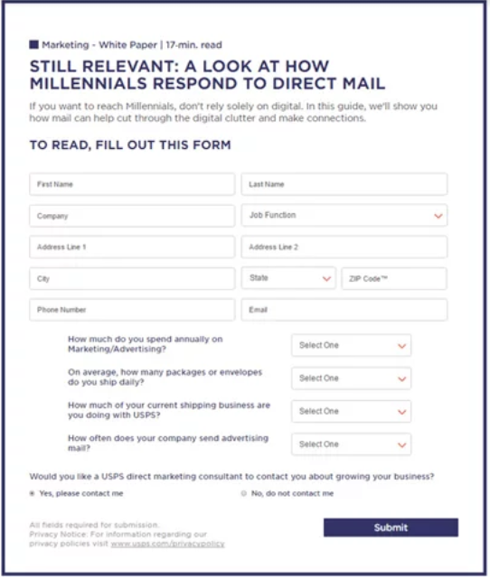
Now that your form is above the fold, it’s paramount to understand what moves your customers to fill it out. Let’s take a step back and say that you found the form to request a quote for your cruise, but it is asking for several items that you don’t feel like filling out in the moment. You sigh and exit out of the page, muttering about how you want the process to be easier.
This is a prime example of what we like to call “asking someone to marry you on the first date.” While having more information up front may aid salespeople, you’ll often sacrifice overall leads to get it, some of which would be customers. We recommend parsing your form down to only what is absolutely necessary for prospecting initiatives, and only asking for more where you know leads have already been engaging with your brand.
While avoiding the first four mistakes will lead to overall conversion rate improvements and an improved user experience, one of the biggest mistakes to avoid is accepting your page as its best version. Do your customers respond better to a blurb on how your offer is “free” or how it will help them save 60% more time? Do they enjoy a lifestyle hero image, or a shot of your product? There is always room for improvement, and it starts with testing.
If you’d like some more help with your B2B strategy, you can get started by filling out the form below or contacting our team.
